
A New Look for Root 2 Rise
In 2017, Executive Director Denise Hanson launched Root 2 Rise at Madison West High School with a conviction built over decades in the classroom: every young person has a future worth building toward, and the right conditions can unlock it. Give students real responsibility. Real trust. Real opportunity to lead. Watch what happens.
Eight years later, Root 2 Rise has trained over 400 high school Tutor-Mentors across Wisconsin and Oregon, expanded learning capacity for more than 8,000 elementary students as a result, and recently launched Thrive, a program that walks alongside alumni as they navigate college, careers, and life after graduation.
As the organization grew, so did a clear sense of what was needed next. In December, Root 2 Rise completed its first real visual identity refresh, built to catch up to where the organization had arrived and, most importantly, to reflect the high school students at the heart of this work.
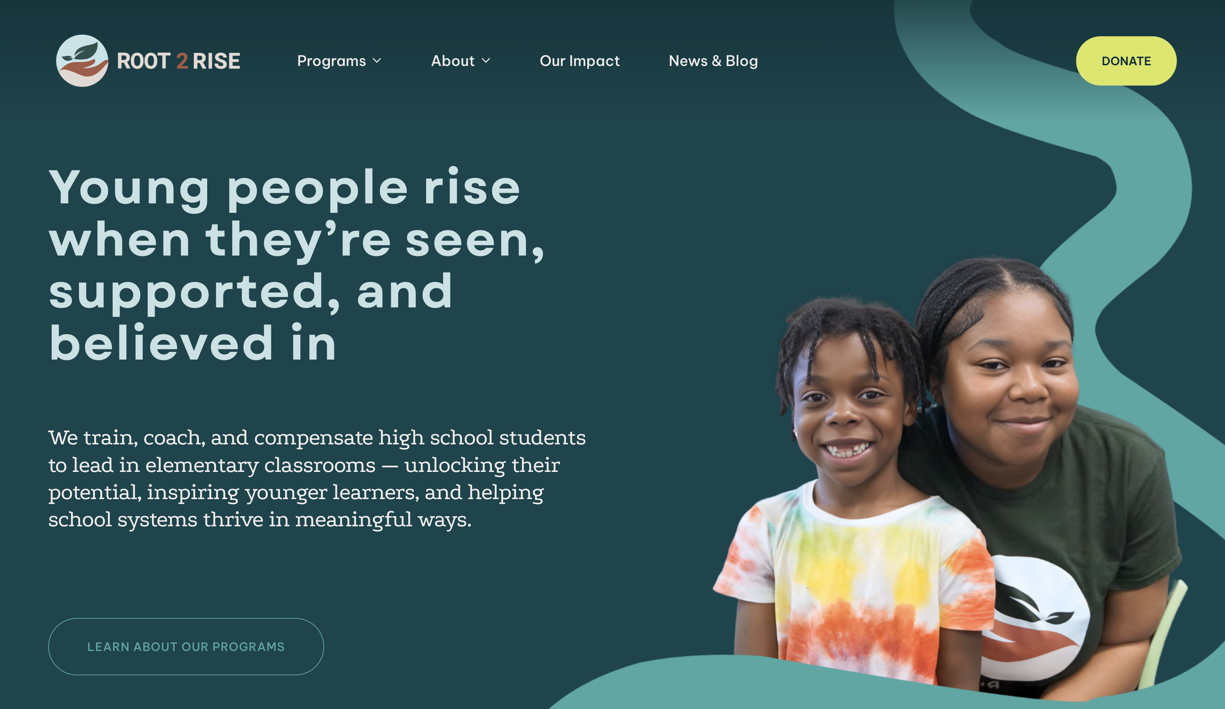
(Our new home page)
Our Tutor-Mentors are high school students who show up every day and do something remarkable. They step into elementary classrooms as leaders, build real relationships with younger kids, and in the process, recharge their own connection to education and their futures.
Our Tutor-Mentors bring energy, motivation, and genuine care into every room they enter. The new branding was built to reflect exactly that.
We kept our original logo and its colors: forest green, warm terracotta, grounding beige, a soft sea foam background. Supportive, rooted, and growth-oriented.
But everything around it is new . . .
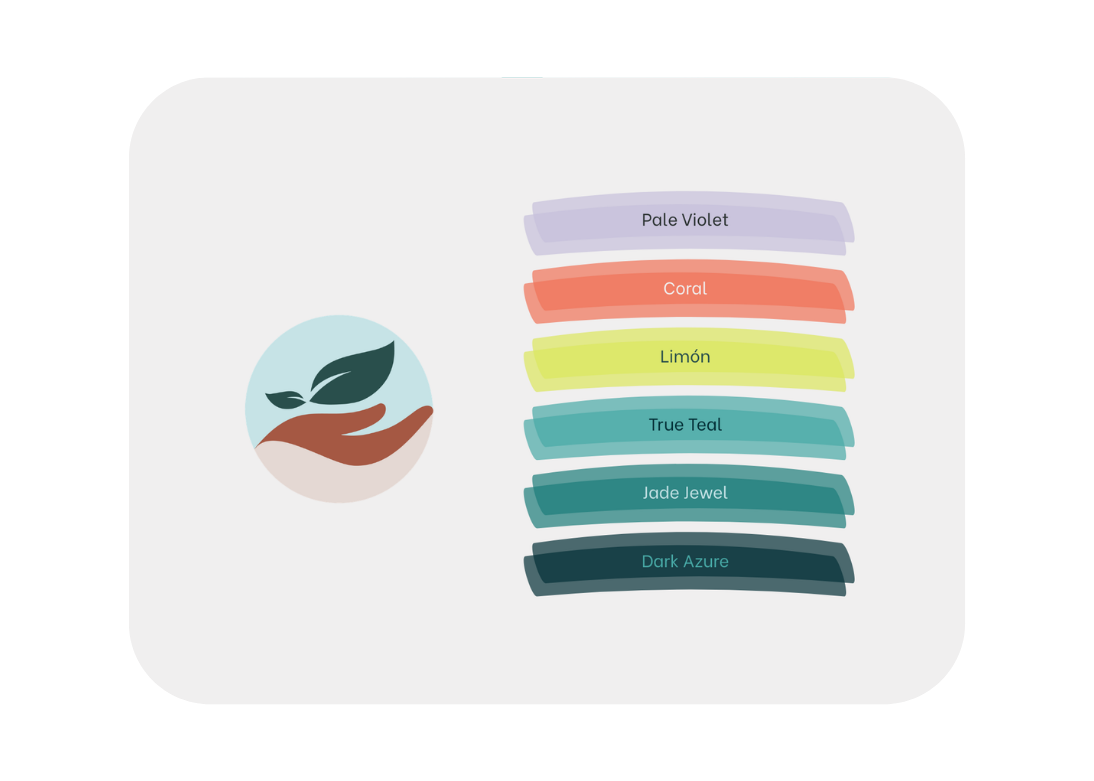
The palette expands those original logo colors outward into vibrant teals, chartreuse, coral, and lavender. These colors reflect the brightness and optimism our Tutor-Mentors carry with them, and the real futures they are actively building toward.
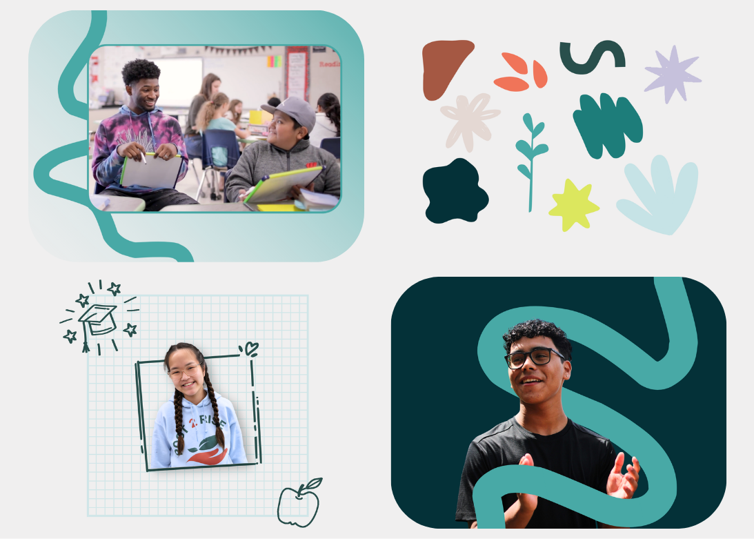
The graphic elements carry the story further. Looping organic shapes and gradients suggest movement and journey, paths that wind but keep going forward. Hand-drawn illustrations and details that look like something pulled straight from a student's notepad keep the brand feeling personal and alive. Graph paper patterns bring it all back to school, the environment where this work takes hold.
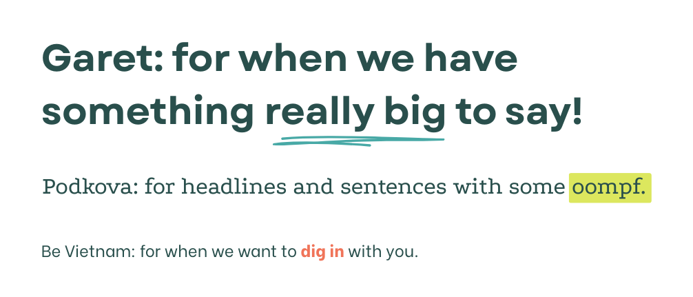
Typography rounded out the refresh. Garet, our bold hero typeface, is rounded, modern, and geometric. Podkova carries the headlines with the familiar quality of a well-loved textbook. Be Vietnam handles body text cleanly and accessibly. Together they strike the same balance the program does: structured and human, inviting, and upbeat.
A brand should reflect the strength of the people at its heart. Root 2 Rise now looks like the Tutor-Mentors who make it what it is: young people stepping into leadership, driving change in their communities, and building futures worth getting excited about.